Collaborative UX · Art history
Journey Through Design
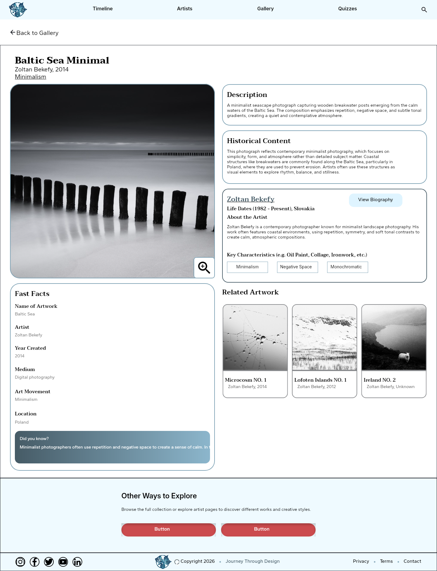
Working with GIT 540 Team 9, I contributed to an art-history experience that helps people move from a broad timeline to artists and individual works.
Design focus Support open-ended exploration while helping people understand where they are and how to return.
PROJECT CONTEXT
The task and my approach
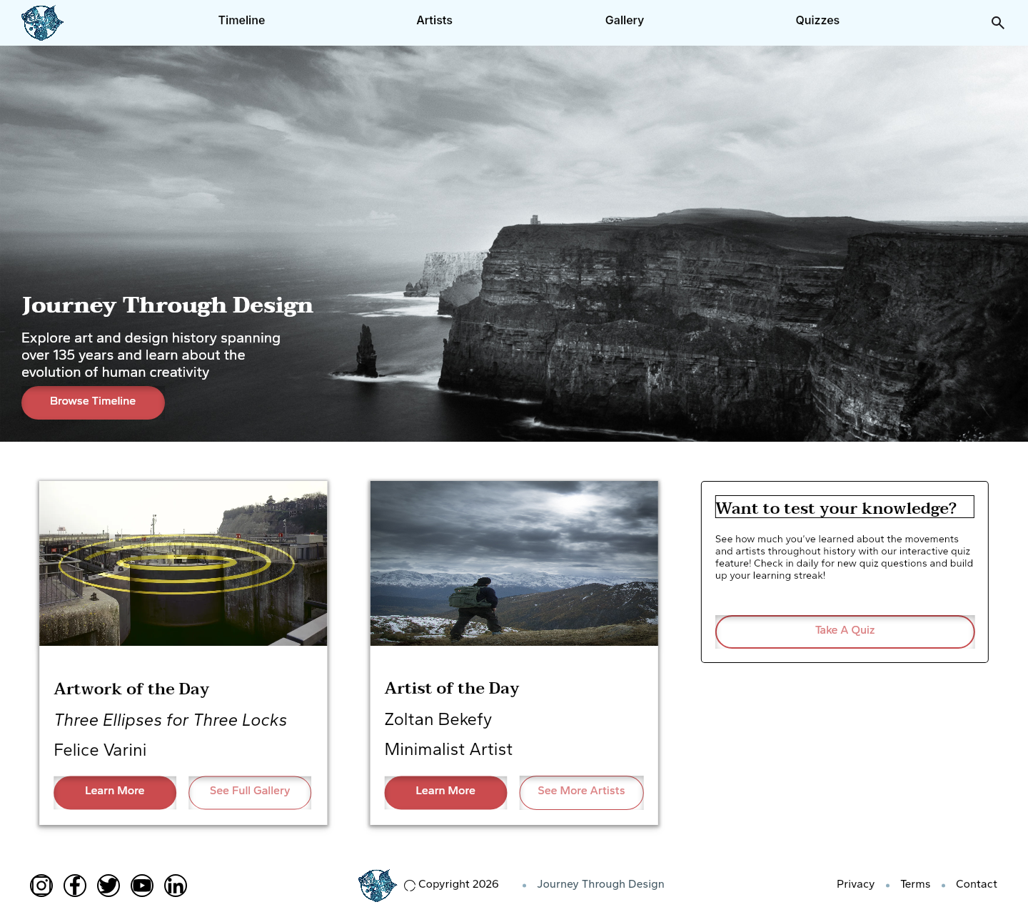
Journey Through Design offers several starting points: a historical timeline, a search, or a filtered collection. The challenge is to connect those routes so exploring one artist or artwork doesn’t become a dead end. Our team developed wireframes, a shared design system, an interactive prototype, and usability-testing materials.
I contributed to the design and usability testing as part of GIT 540 Team 9. The interface screens are shared team work; the testing observations discussed here come from my notes in the project.
01 / DESIGN DECISIONS
Offer more than one way into the collection
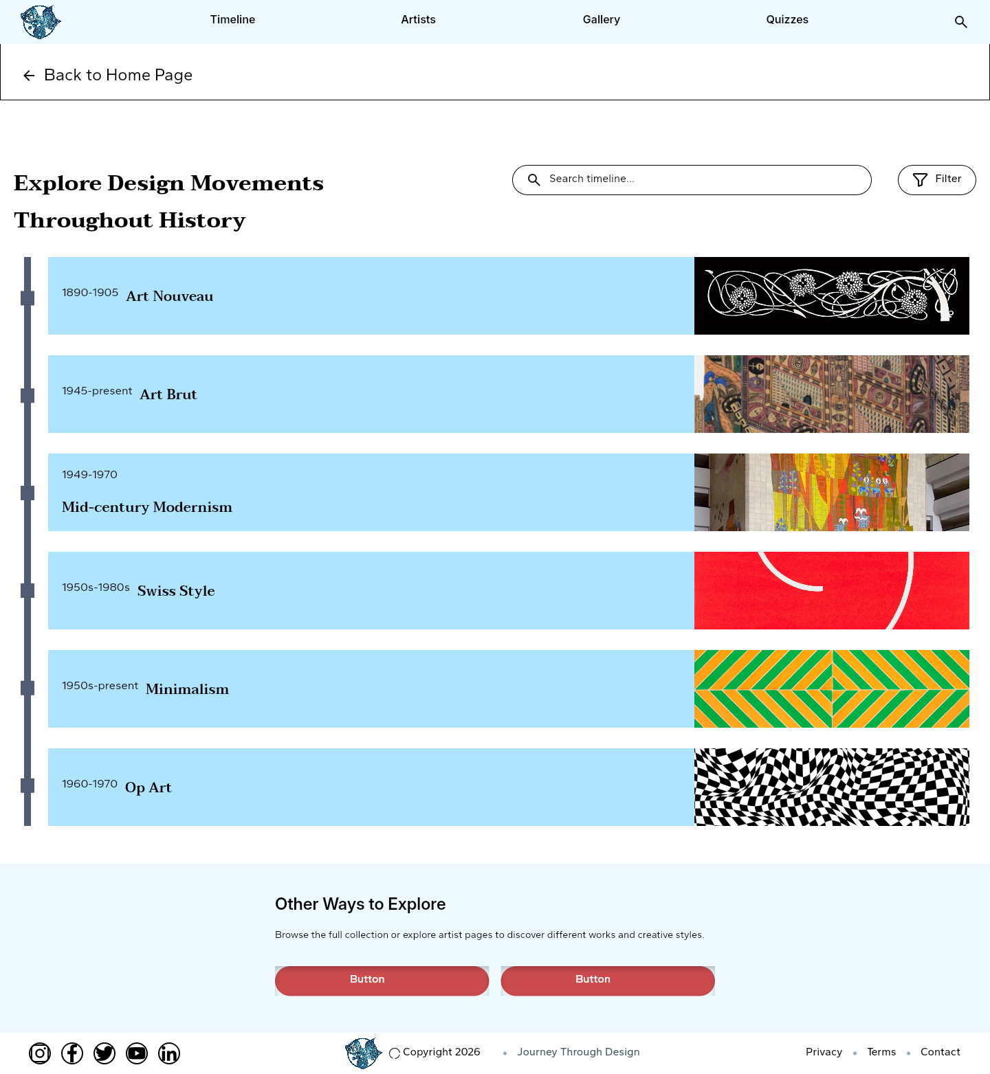
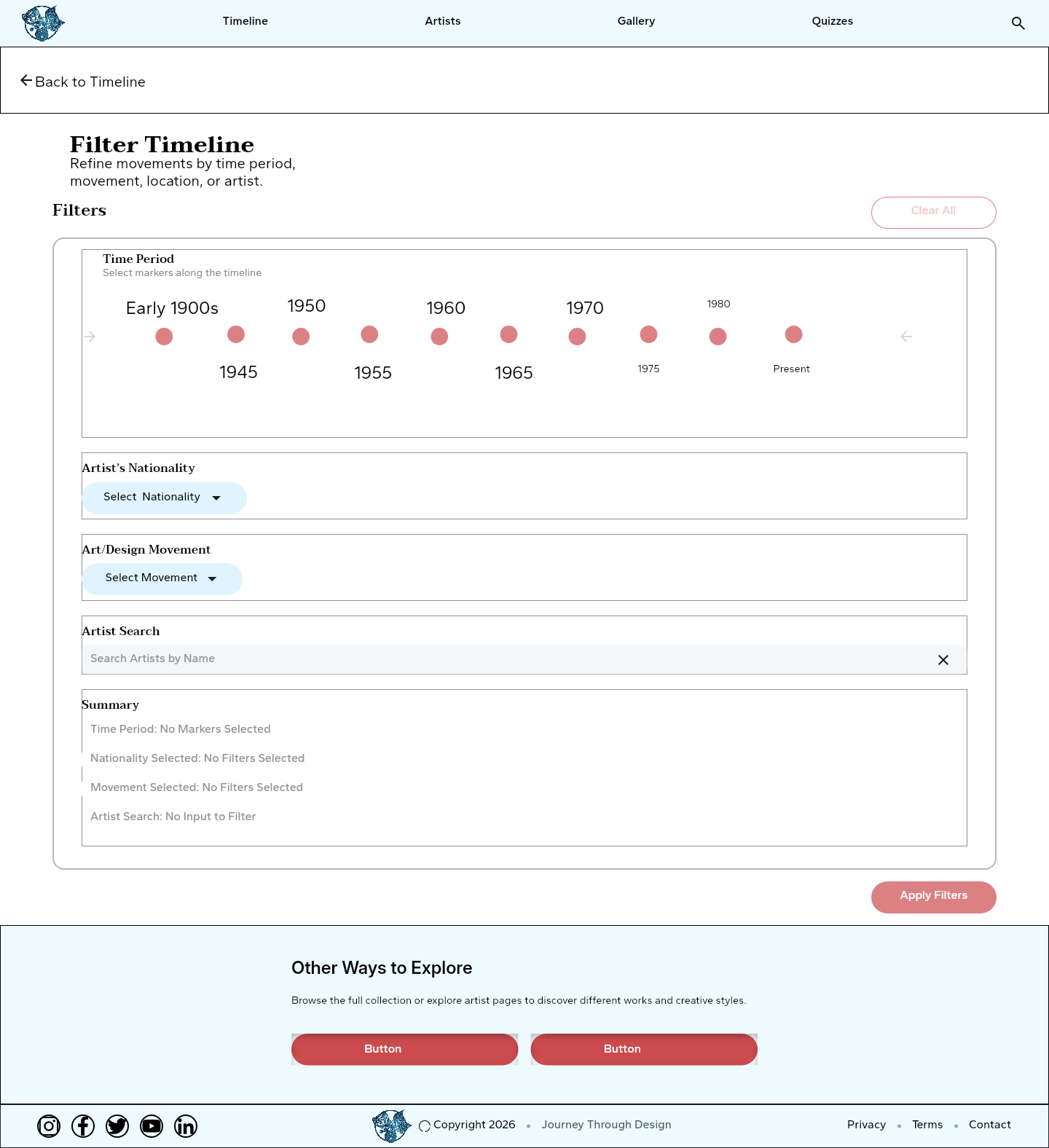
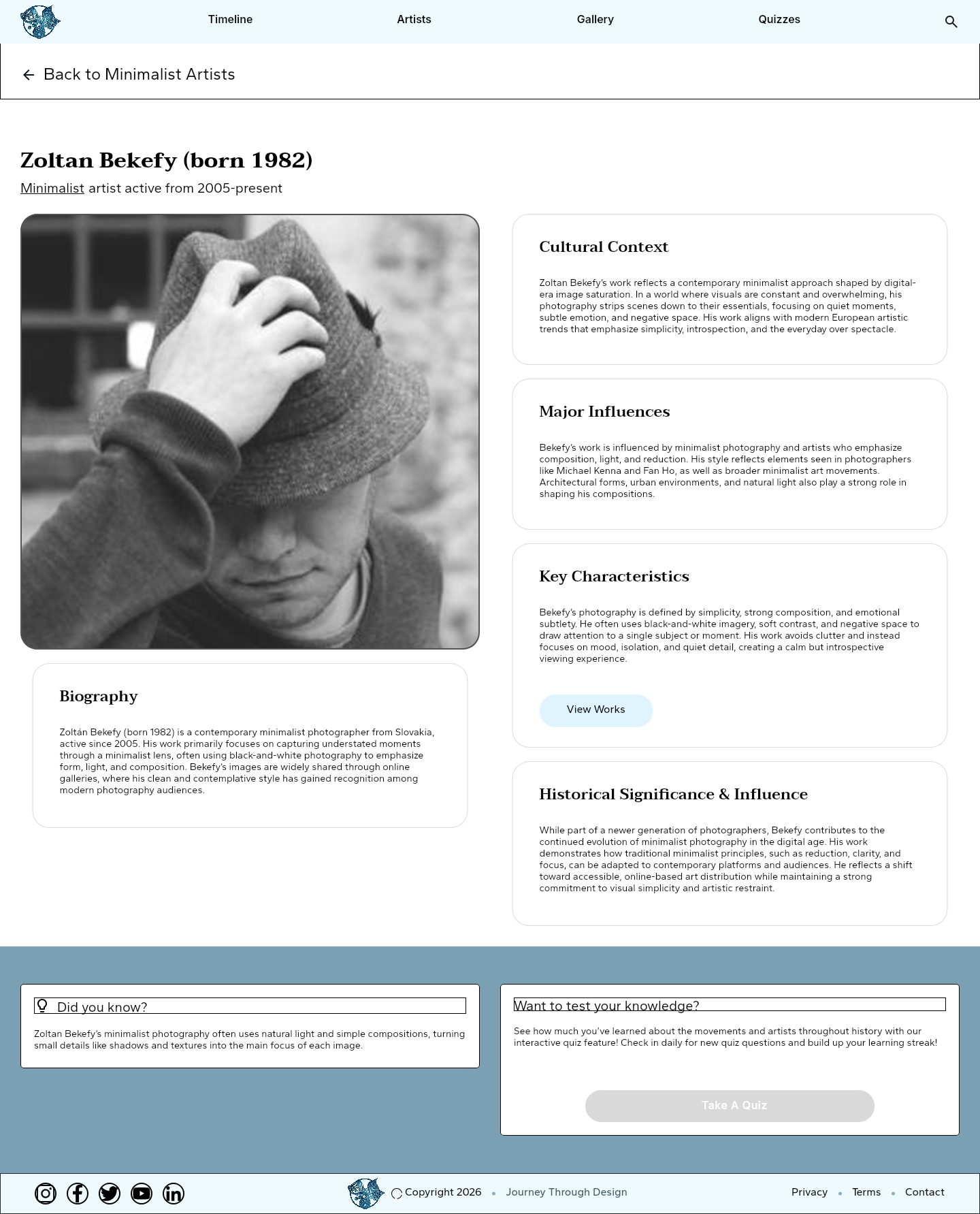
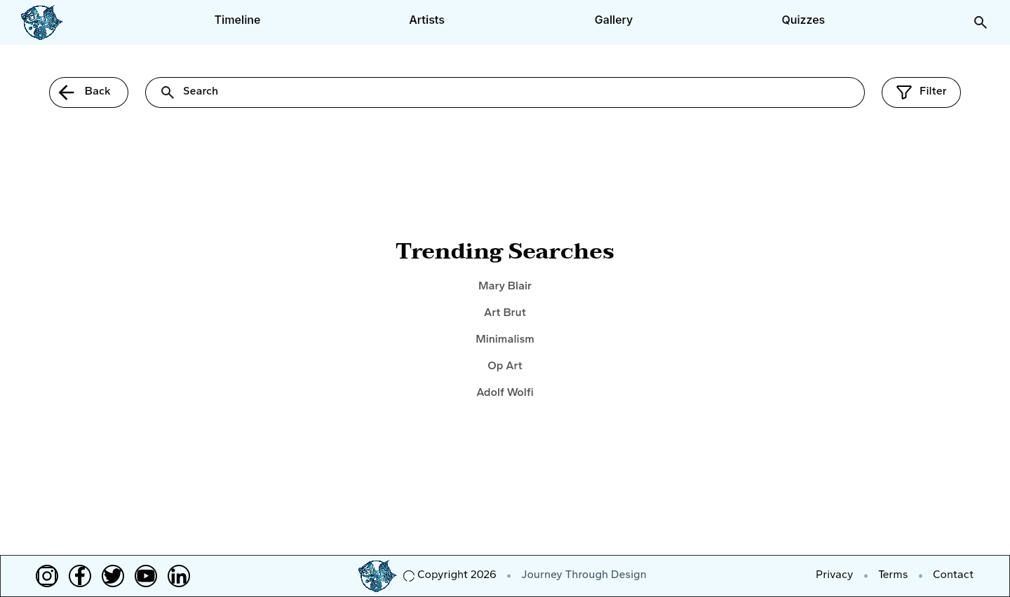
A timeline suits someone exploring a period, while search supports someone with a subject in mind. Filters for time period, nationality, movement, and artist narrow the collection further. Artist and artwork pages connect these broad views to individual subjects. Together, those routes support both browsing and a more directed search.
02 / DESIGN DECISIONS
Look beyond whether a task was completed
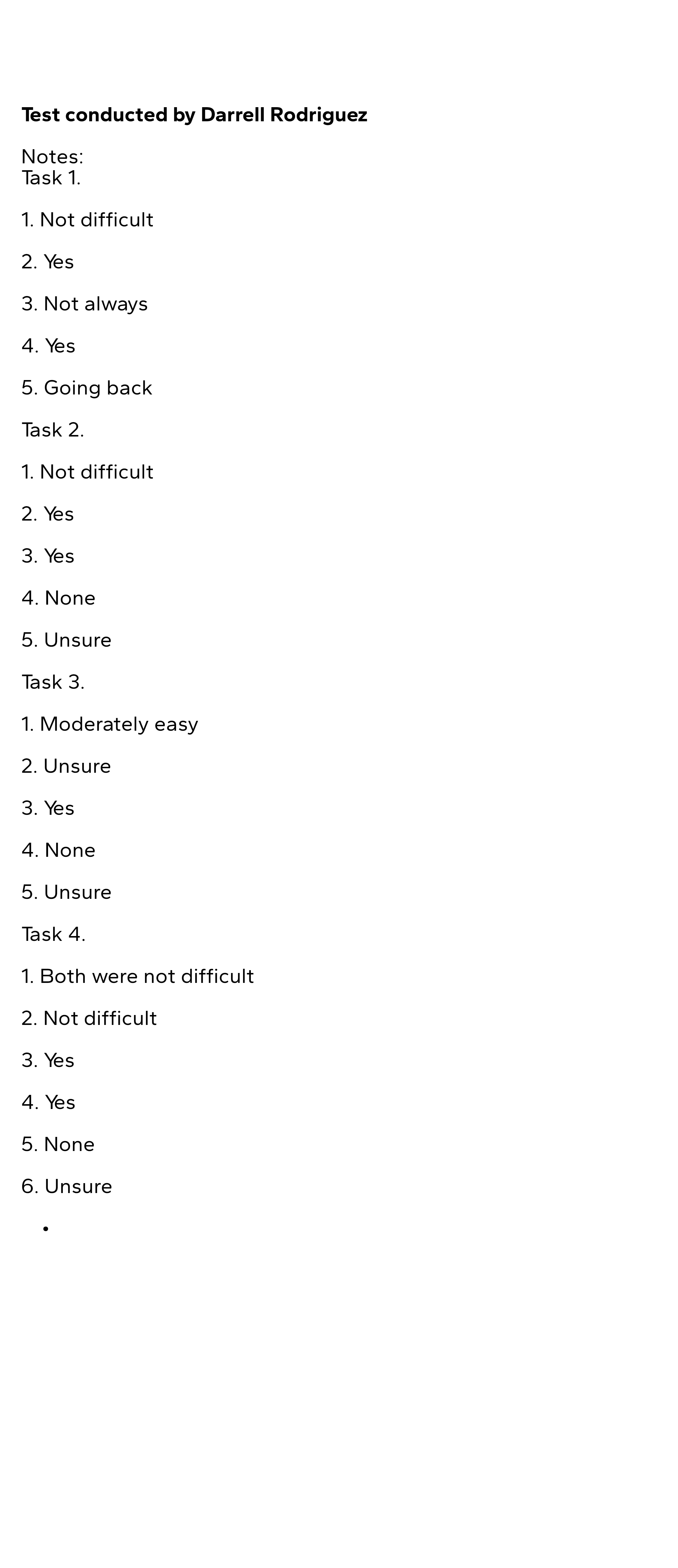
In my mid-fidelity testing notes, a participant completed the first task but did not always know how to return. They described “Going back” as confusing. Filter categories also prompted uncertainty. Task completion alone would have missed those moments; the observations point to clearer return paths and more understandable filter choices.
03 / DESIGN DECISIONS
Keep the experience consistent, then check it again
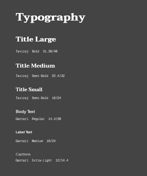
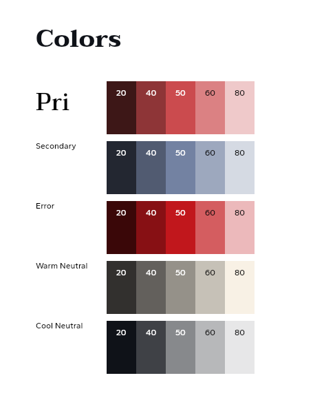
The team’s shared typography, blue and red palette, navigation, and controls give the different page types a common language. My later notes record successful navigation through gallery, search, timeline filters, and artwork. That is encouraging feedback from those sessions, but I’d still retest the earlier navigation concerns with new participants before considering them resolved.
REFLECTION
What I’d take forward
The strongest lesson in this project is the gap between finishing a task and feeling confident along the way. My testing contribution helped make that distinction visible. In another iteration, I’d prioritize return navigation and filter labels, then use the same tasks to check whether the changes address the observed confusion.
Collaborative academic project · GIT 540 Team 9. Interface and design-system screens represent the team’s work; testing notes identify my contributions.
Let’s talk about this project ↗