Accessibility · Interface analysis
Loaded Accessibility Review
I reviewed an e-commerce journey through five accessibility lenses, using annotated page reconstructions to make potential barriers easier to discuss.
Design focus Connect accessibility concerns to specific elements and steps in a shopping task.
PROJECT CONTEXT
The task and my approach
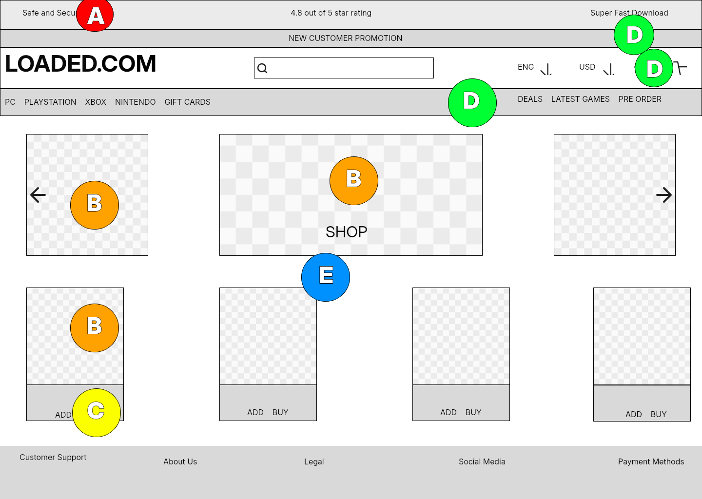
A shopping flow needs to work across the homepage, product page, and checkout. I reconstructed these page types and used lettered annotations to organize potential accessibility issues. This makes the review traceable: each marker points to an element and a category in the legend.
01 / DESIGN DECISIONS
Give each annotation a clear purpose
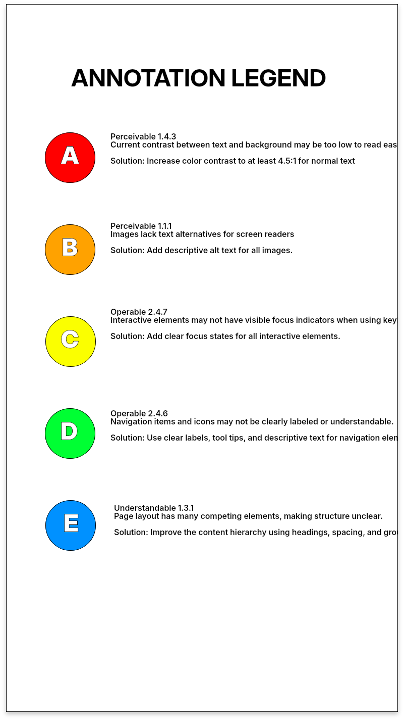
The legend groups the review into contrast, alternative text, keyboard focus, form labels, and heading hierarchy. Using the same categories across pages makes it easier to compare patterns and see where further investigation is needed.
02 / DESIGN DECISIONS
Follow the task into the form
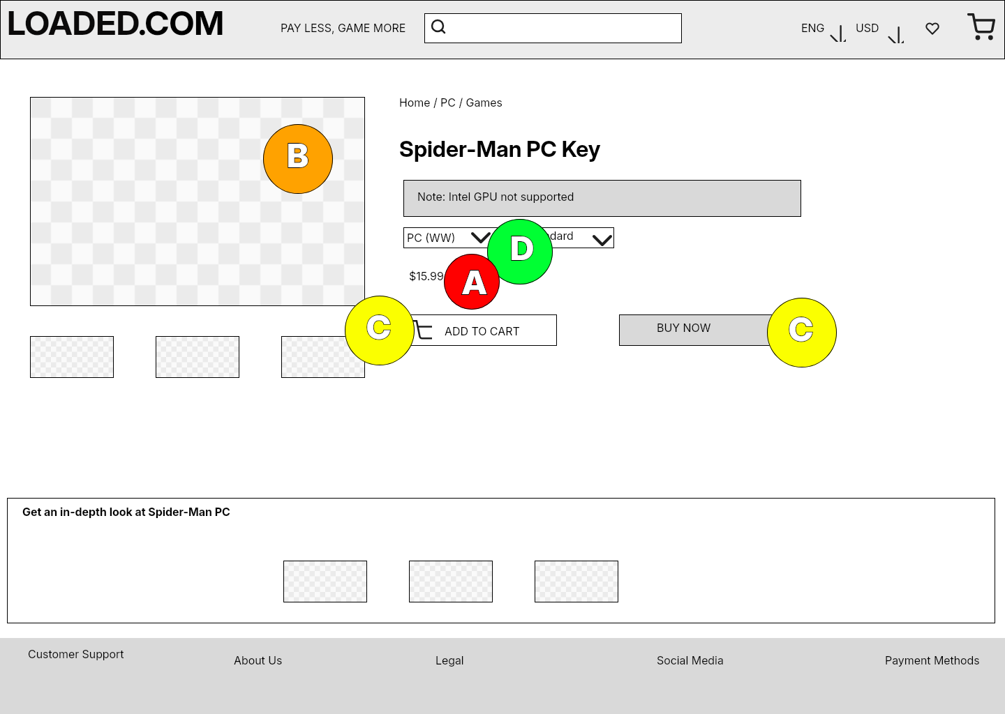
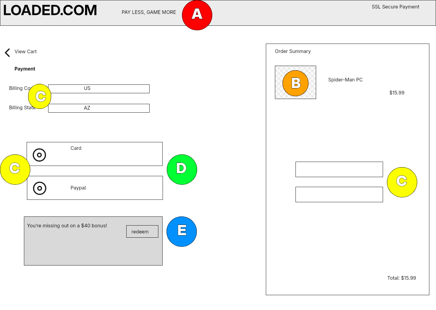
The review continues from browsing to product selection and checkout. At checkout, labels and focus become especially important: people need to understand what each field asks for and where they are as they move through it. The annotations identify what to inspect in the implemented page.
REFLECTION
What I’d take forward
The result is an organized starting point for an accessibility review. The next step is verification in the live implementation: measure contrast, inspect text alternatives and semantics, and walk through the task using a keyboard. A wireframe can flag a concern, but it cannot establish how the underlying code behaves.
Independent academic review of loaded.com · Annotated Figma reconstructions. No client affiliation; this is a design review rather than a live-site compliance audit.
Let’s talk about this project ↗