Responsive UX · Wireframe study
City of Phoenix
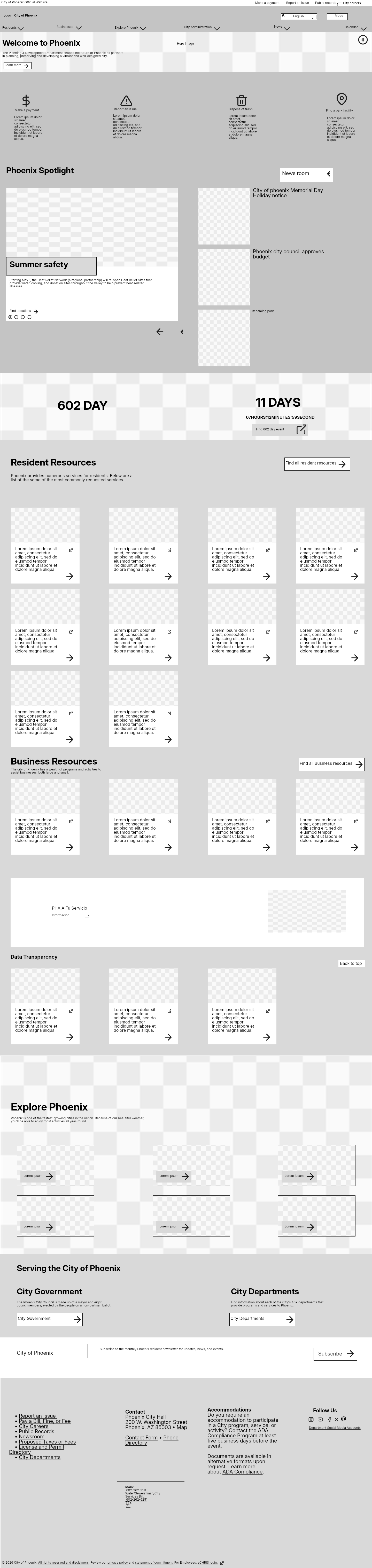
I recreated the City of Phoenix homepage as desktop and mobile wireframes to study how a large amount of public information is organized across screen sizes.
Design focus Understand how service shortcuts, news, and city resources share one page without losing their hierarchy.
PROJECT CONTEXT
The task and my approach
Residents, businesses, and visitors arrive at a city website with very different tasks. This study looks at how those needs sit together on one long page. Recreating the layouts in low fidelity let me focus on grouping, order, and screen space.

01 / DESIGN DECISIONS
Separate immediate tasks from deeper information
The desktop wireframe combines audience navigation, common service shortcuts, heat-relief information, news, and government resources. Actions such as paying, reporting an issue, and finding trash information have a different urgency from browsing city news. Reconstructing the page made those layers easier to examine.
02 / DESIGN DECISIONS
Study what changes when the page narrows
The mobile version is 390 px wide, compared with 1440 px on desktop. With less room for content side by side, grouping and reading order become more prominent. Scroll through the wireframes or enlarge them to compare how the page is arranged at each size.
REFLECTION
What I’d take forward
This is a study in responsive structure and information hierarchy. If I extended it into a redesign, I’d first identify the most common resident tasks and test how quickly people can locate them on mobile. That evidence would help determine what deserves priority, rather than rearranging the page on visual preference alone.
Independent academic recreation of the City of Phoenix website · Desktop and mobile Figma wireframes. This was a study, not commissioned city work.
Let’s talk about this project ↗