Mobile UX · Event discovery
Mood
I designed Mood to connect the decisions around a night out: finding an event, choosing tickets, and knowing where to find them afterward.
Design focus Keep browsing, filtering, and booking connected, with a clear destination for purchased tickets.
PROJECT CONTEXT
The task and my approach
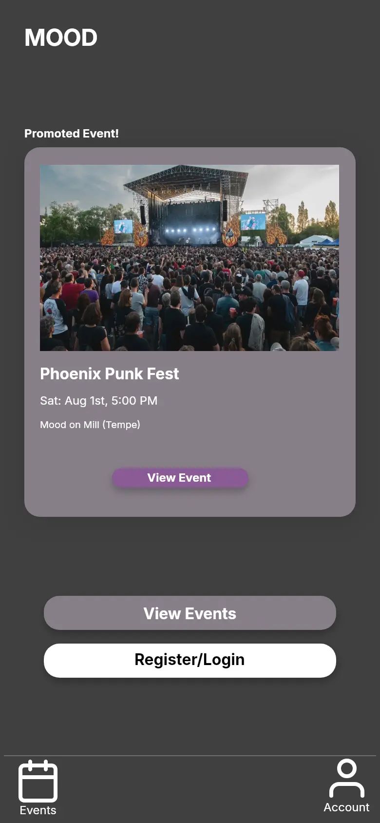
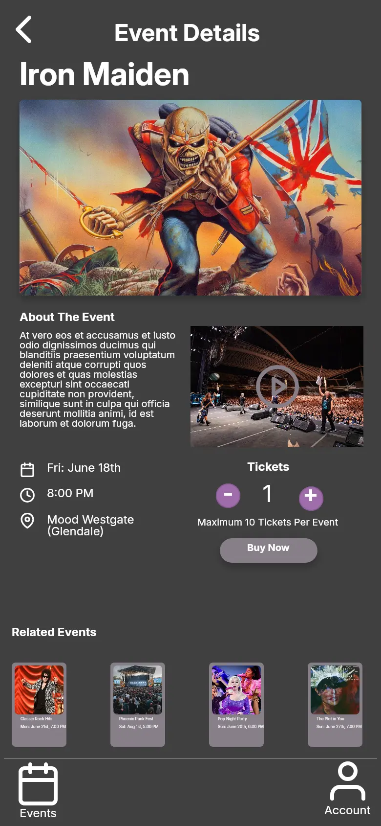
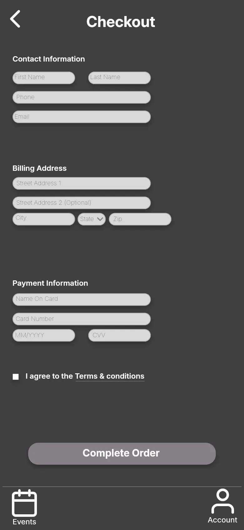
An event listing is only the start of the task. Someone still needs to decide whether it fits their plans, choose tickets, check out, and retrieve the booking. I worked through that whole journey in Figma, starting with low-fidelity screens and developing a visual prototype.
01 / DESIGN DECISIONS
Map the whole trip through the app
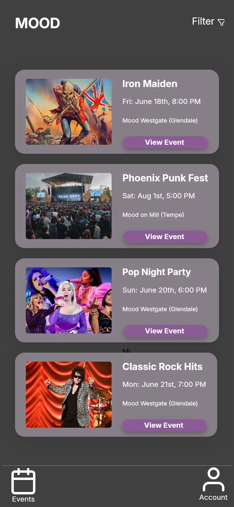
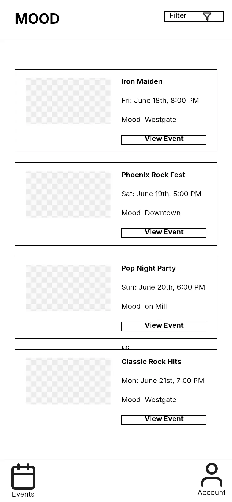
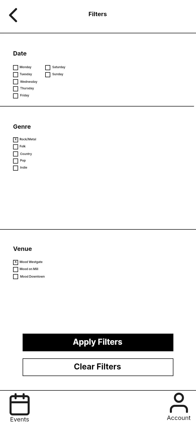
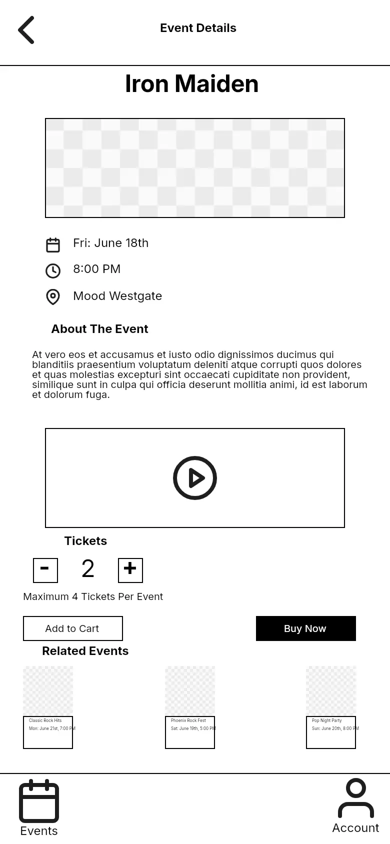
I started with the sequence of decisions: browse events, narrow the choices, open an event, select tickets, and check out. Including confirmation, account, and ticket screens early helped me consider what happens after the transaction, too. The wireframes establish those connections before introducing imagery and color.
02 / DESIGN DECISIONS
Show people what they’ve filtered
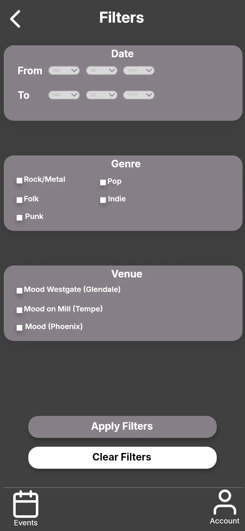
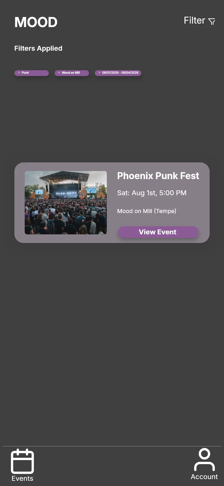
The early filter screen uses days of the week. In the developed prototype, a date range, genre, and venue give the search more specific boundaries. Applied filter chips carry those choices back to the results screen, so people can see why they’re getting that set of events. Event imagery provides a second way to scan the listings.
03 / DESIGN DECISIONS
Give the booking a clear ending
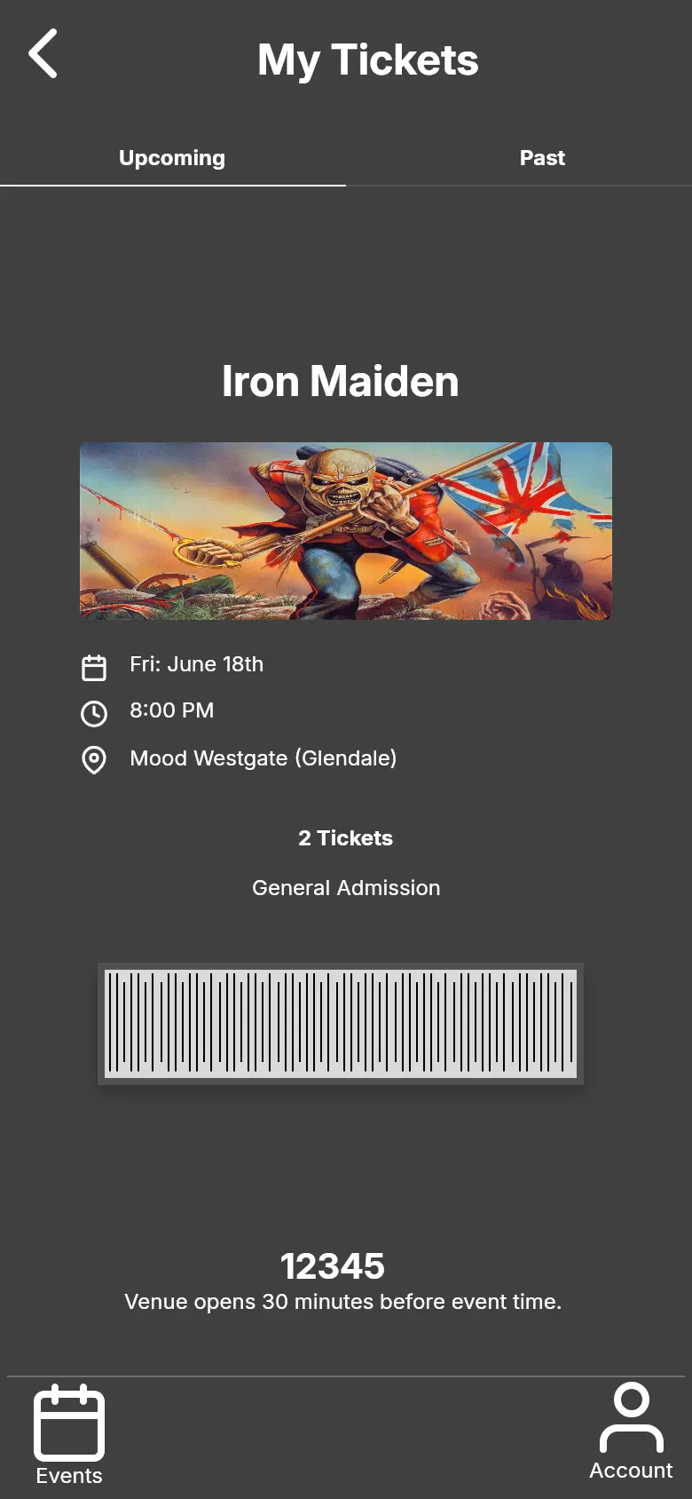
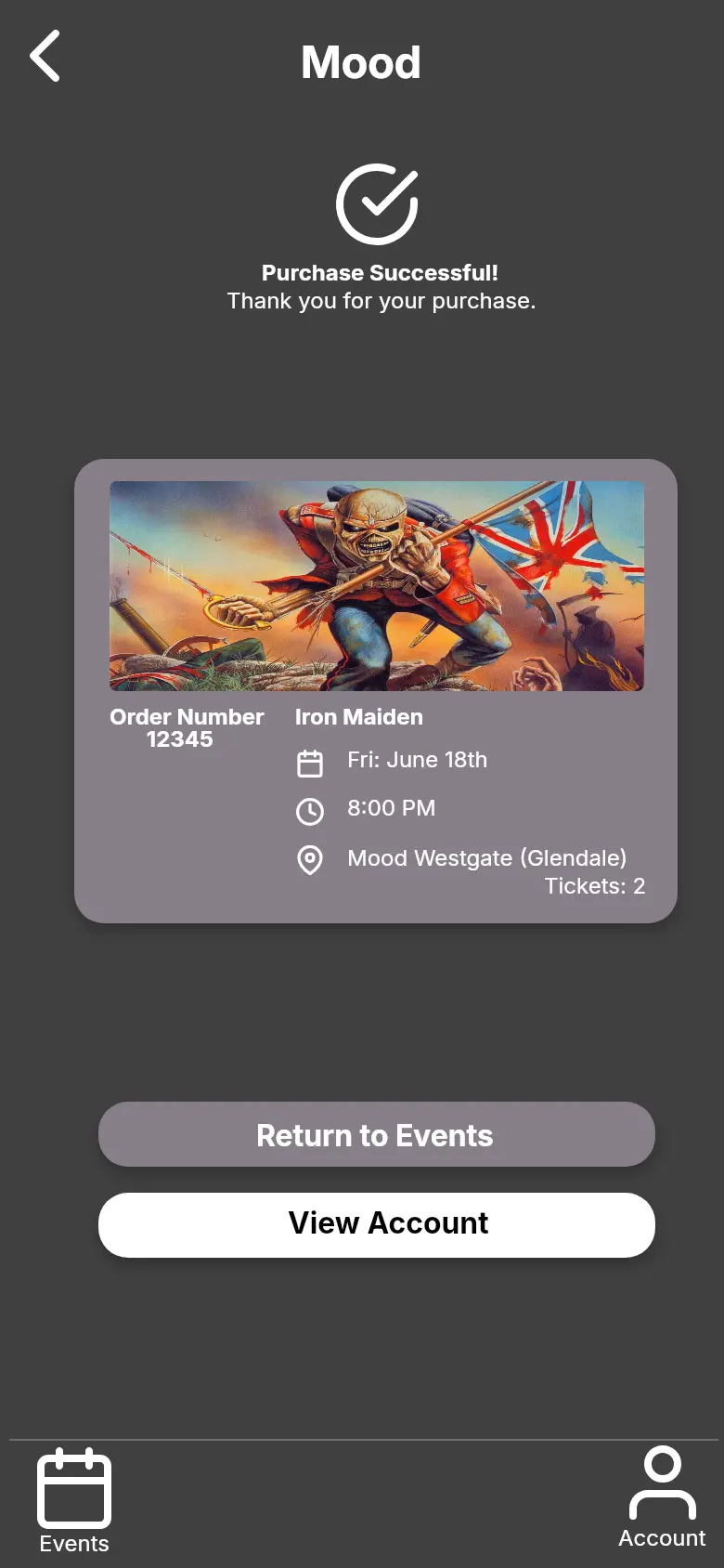
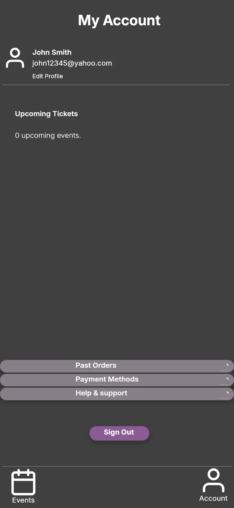
The design continues past payment to confirmation and a dedicated ticket screen. I also included an empty account state for someone who hasn’t made a booking yet. These states matter because a successful purchase still leaves a practical question: where is my ticket when I need it?
REFLECTION
What I’d take forward
The result is a connected event-booking prototype, developed from low-fidelity wireframes. The next thing I’d test is whether a first-time user can apply a filter, buy a ticket, and find it again without help. I’d pay particular attention to whether the applied filters are noticeable and the confirmation makes the next step clear.
Individual academic concept · Figma wireframes and visual prototype. The screens show design work; usability testing is a proposed next step.
Let’s talk about this project ↗